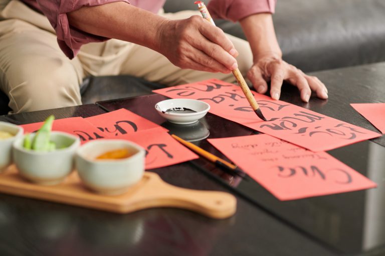
Creating your own lettering style is more than just writing beautifully — it’s about expressing personality through each curve, angle, and flourish. Whether you’re just starting out in calligraphy or have been practicing for a while, developing a unique script can transform your work from simple to signature. Here’s how to approach the process with confidence and creativity.
Start with Inspiration, Not Imitation
The first step to crafting your own style is understanding what you like. Study a wide range of lettering styles — modern, vintage, brush, gothic, serif, sans serif. Observe how different artists use contrast, spacing, embellishments, and rhythm. Save the pieces that resonate with you, and ask yourself why they stand out. Inspiration helps train your eye and gives you a visual vocabulary to pull from, but the goal is not to copy. It’s to understand the choices behind the work so you can begin making your own.
Practice the Basics with Purpose
Every unique script is built on a foundation of solid technique. That means daily practice with basic strokes, spacing, line weight, and consistency. Explore different tools — brush pens, pointed nibs, fine liners — and see how each influences your line quality. As you gain control, you’ll begin to see where your natural hand leans: Do your strokes tend to be more curved or angular? Do you prefer tight spacing or open flow? These tendencies can form the basis of your emerging style.
Experiment with Letterforms
Once you’re comfortable with basic alphabets, start bending the rules. Change the height of ascenders and descenders. Exaggerate certain loops. Try connecting letters in unexpected ways. Don’t worry about getting it perfect — this is the exploration stage. Fill pages with loose variations. Some might look awkward, others might spark new ideas. The goal is to loosen your grip on “how letters should look” and begin discovering how you want them to look.
Create Your Own Alphabet Set
Take the elements you liked from your experiments and begin shaping a full alphabet. Draw both uppercase and lowercase versions of each letter in your style. Keep your proportions somewhat consistent but give yourself room for variation — real handwriting is never completely uniform. A personalized alphabet becomes your design playground, and you can refine it over time based on how it feels to write and how it looks in use.
Define Your Rules — Then Break Them
Every strong lettering style has a set of internal rules, even if they’re subtle. These could include consistent stroke angles, a standard width for stems, or a predictable slant. Once you’ve identified these rules in your script, you can play with how and when to break them for emphasis or flair. For example, maybe most of your letters are narrow and upright, but you decide to widen and curve just the “R” in a wordmark to give it personality. That’s the power of intentional design.
Apply Your Style to Real Projects
It’s one thing to design letters in isolation, but real magic happens when you use them. Apply your style to greeting cards, quotes, logos, social posts, or branding mockups. This helps test the functionality and flexibility of your script. You might find that some letter combinations feel awkward or that your spacing needs adjustment. Iterating through real use cases is where your lettering style becomes truly alive.
Keep Evolving
Your first personal style won’t be your last. As you learn more, try new tools, and gain confidence, your style will naturally evolve. Some elements will stay with you, while others will shift. The key is to keep practicing, experimenting, and creating. Style is not a fixed destination — it’s an ongoing journey that reflects your artistic growth.


